.png)


#UIUX #SpeculativeDesign #IFirstUXDesign
NaviSpace
Designing a futuristic mobile app through speculative design and creative problem-solving.
Applied Skills: Visual design, Interaction Design, Prototyping, Wireframing
Overview
Scope
Focused on UI/UX design; no user research or testing was conducted.
Hats Worn
Sole designer responsible for ideation, branding, and prototypin
Timeline
Oct 2022 - Dec 2022
(2 Month Timeframe)
Tools
Figma
Figjam
Purpose of NaviSpace
Navi-Space is a speculative design project envisioning a future where lunar navigation is essential. The app aims to provide safe and efficient navigation on the moon while keeping users connected with loved ones in potential danger zones.
Vision & goal of this project ...
Challeng me to apply UX principles in an unfamiliar and speculative setting, requiring creative design choices & problem-solving skills

This is a story of ...
How I grew from a novice into a problem solver, learning to balance imaginative design with practical user needs under unfamiliar constraints.


Background
So how did this concept and NaviSpace came to be ...?
Thing of the Future!
To think outside the box and brainstorm app designs, Things of the Future! was used to generate random prompts. Then using the prompts, I created an app story, explaining when, where, and how it would be used.
Following are my generated prompts for NaviSpace:

Initial App Pitch:
In the year 2122, humanity seeks refuge on the Moon. With younger generations' curiosity leading them into unknown territories, safety is paramount. Moonquakes, infectious fog, meteoroids, and the unknown lurk. To ensure safety, we introduce NAVI-SPACE—a mobile app with GPS tracking stickers. Parents can monitor their children's locations, and a speed-dial feature ensures contact even if their device is lost. Easy to use, simply attach the sticker to clothing, pair it with the app, and stay connected in real-time.
Who are the targeted audience and users ...?
Persona Development

The personas for the Navi-Space project were developed using general assumptions based on speculative scenarios of lunar life. These personas represented key user archetypes, such as:
Each persona plays a vital role in shaping the narrative of Navi-Space, contributing unique perspectives and challenges that inform the app's design. Together, they create a cohesive user journey, showcasing how the app addresses diverse needs and scenarios. The User Story will be revealed at the end of the case-study.
Melissa, as the primary user, serves as our lens to explore the app's core functionality and essential features. Through her story, we’ll uncover how Navi-Space ensures safety, connectivity, and convenience for individuals adapting to lunar life. The interconnected experiences of all users come together in a unified story that will be revealed in the final design showcase.

Initial Design
Understanding what the structure of NaviSpace would look like ...
Wireframe
Starting Screen — Shows a map of the moon with the user's current location. Users can interact with the map by swiping in all directions to explore other areas and zooming in/out for detailed or broader views.

Bottom Center Menu (Left to Right):
-
Locate All Stickers: Displays all sticker locations on the map.
-
Location Pin-Point: Highlights the user’s current position on the map.
-
View Danger Zones: Identifies hazardous areas on the map and checks if the user is within a danger zone.
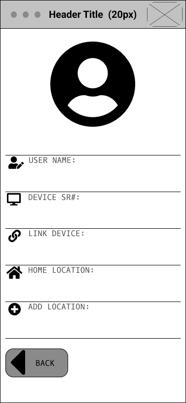
The dropdown menu on the left: provides quick access to essential features, including adding/removing family member trackers, adjusting sticker settings (vibration, ringtone, and light), checking sticker functionality, and managing user profile settings.
User Icon: Represents the user’s current location on the map for easy reference.
Locate Stickers:
When the user selects ‘Locate Sticker’ button, sticker icons appear on the map, showing the locations of family members. Each sticker has a label identifying its user. Clicking on a specific sticker opens a small pop-up screen with details about the sticker’s owner and two actionable options such as getting directions to their locations or contacting them.

View All Stickers — The second view displays all stickers, showing where users in your contacts are located relative to your position. It maintains the same interaction as the main map, allowing users to pan, zoom, and highlight specific stickers by clicking on them.
Danger View — The third view provides a clear and immediate understanding of the safety status across all regions of the moon, helping users navigate and plan accordingly.
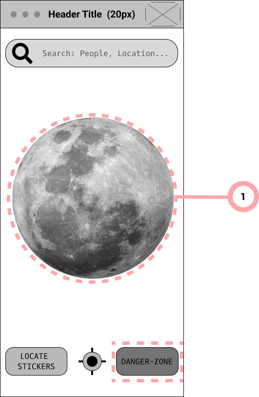
Danger-Zone View:
When the user selects the danger-zone button, the map of the moon displays color-coded areas representing safety levels:
-
Red: High-danger zones.
-
Yellow: Medium-danger zones.
-
Unshaded: Safe areas.
Sticker Settings and Mechanics:
The Sticker Settings and Sticker Mechanics share the same screen, with users able to toggle between the two modes by selecting the corresponding button at the top of the interface.
-
Sticker Settings: Allows users to customize general settings, such as changing the ringtone, vibration mode, and light flicker patterns.
-
Sticker Mechanics: Displays detailed information about the sticker’s components, including the battery, GPS chip, light displays, hardware, and software. This page provides feedback on each part’s condition, alerting users if any component is damaged or requires replacement.
This design ensures easy management and maintenance of stickers through a streamlined interface.
Sticker Settings and Mechanics Buttons:
The buttons for Sticker Settings and Sticker Mechanics are located at the top of the screen. The interface switches seamlessly between these two views based on the user’s selection, providing quick access to either feature.

Sticker Display:
The sticker takes center stage in both the Settings and Mechanics screens, allowing users to interact with it directly. Detailed information about each part of the sticker is displayed alongside it, including the current condition of each component, ensuring users can monitor and manage their stickers effectively.
Look and feel of NaviSpace...
Brand Identity
I began by using the keyword 'Moon' to explore related concepts and brainstorm ideas for the app’s theme. This exercise helped inspire the color palettes and font selections that define Navi-Space’s brand identity. The following words came to mind during this process.

For the visuals, I decided to focus on the words listed on the left side of the mind map. These words were easier to visualize for Navi-Space’s aesthetic and thematic elements.
The word “Cyberpunk” kept coming up during the mind-mapping process, inspiring the theme for the design. I created a moodboard based on this futuristic, neon-lit style and finalized a bold color palette to match the cyberpunk vibe.


For the visuals, I decided to focus on the words listed on the left side of the mind map. These words were easier to visualize for Navi-Space’s aesthetic and thematic elements.
Final Products
Individual: Navispace
My primary focus was to create a functional speculative mobile app with unusual prompts. Applying both problem-solving skills and design skills and familiarize myself with UX Principles.

Mid Fidelity Wireframes


Initially, while applying the branding, I realized I was unconsciously using design principles suited for mobile games. This approach, while visually dynamic, didn’t align with the app’s purpose as a practical navigation tool. Recognizing this, I pivoted to studying real-world applications, particularly Google Maps, as its design affordances better matched Navi-Space’s functionality and user goals."
This led me to simplify the color palette and typography, ensuring a more cohesive and less overwhelming design
I also reevaluated the emotions the app should evoke—shifting toward feelings of safety, calm, and trustworthiness while retaining a playful edge. This helped me refocus Navi-Space as an age-friendly, practical, and reliable daily-use tool
Additional Screens — The second view displays all stickers, showing where users in your contacts are located relative to your position. It maintains the same interaction as the main map, allowing users to pan, zoom, and highlight specific stickers by clicking on them.

2nd Iteration
Starting again from square 1 ...
Brand Identiy 2.0
I decided to explore the look of Navispace a bit more by designing additional pages and experiment with different designs, features/affordances, interactions designs.


-
colors: narrowed the colors down to focus on the following 5 colors and experimented by adding gradients.
-
typography, I chose Nunito as the Main and only font for its playfulness and legibility.
Understanding afforance type and their behaviour ...
Interactions
At some point, I felt like I hadn't grasped the potential Navispace had and it was imagine it with only 6 pages and I am not trying to recreate the wheel. So I took this opportunity to look at different affordances avaialble to the public on current popular navigation and transit apps like Waze and Google Maps and started creating my own functional animated components.


Collaboration: User-Story
I was simultaneously collaborating within a group of 4 and worked on understanding our users and their emotional and practical needs on a daily basis. The product was a user story.

Reflection
Challenges
The NaviSpace project was my first practical experience in UX design, where I learned every step of the process from scratch. Initially, my approach was influenced by a game design mindset, reflected in my choice of colors, fonts, and buttons. Recognizing this, I revisited the basics by creating additional low-fidelity screens. This helped me thoroughly explore the app’s functionality and flows, building a strong foundation for a more polished final design.
What Went Well
I was particularly pleased with how the interactive "moon map" turned out, as it exceeded my expectations and taught me a lot during its design process. The on-route navigation animation was a highlight, effectively showcasing the app’s navigation functionality in a seamless and intuitive way.
What Could be Better
Looking back, I’ve realized that practicality doesn’t always need to be overly complex—minimalism and the thoughtful use of white space can enhance a design significantly. I also recognize that the menu bar could have been sleeker to better align with the overall design feel.
Additionally, I should have used my peers feedbacks session more effectively during the project